

Refreshing the CU Boulder brand was a multi-layered process that included a team of in-house design professionals from across the university. I played a key leadership role in this two-year effort.
The goals of the refresh were to evaluate the current state of the CU Boulder Brand, solve for shortcomings, evolve the brand while maintaining it’s equity, align visuals and voice to the goals of an integrated marketing plan, and to be more accessible in a digital landscape.
The process included many steps. It began with an audit of all designs created from the last 3 years, surveys that rated those designs for efficacy and meeting brand standards, continued with a current state report, proposals to solve for shortcomings found, rounds of testing and mockups across platforms, production of templates, toolkits, and assets, and concluded with creating a roll-out plan and brand trainings to accompany.
A secondary typeface, Noto Serif, was added as well as a secondary color palette including an accessible gold. Color, icon, photo, video, logos, and audience guidelines were audited and tested. A new brand site was designed with new guidelines and examples. Additionally, brand kits were created on Canva and Adobe Creative Cloud. More brand assets, templates, brand trainings are scheduled to be communicated out in late 2025.

CU Boulder Brand Refresh


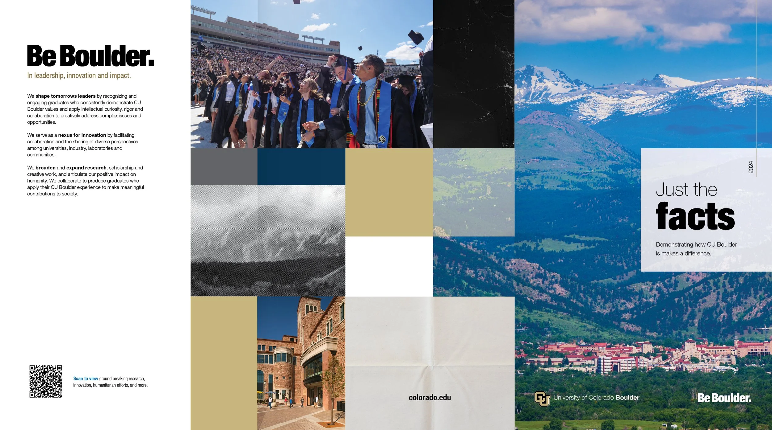
Admissions brochure example


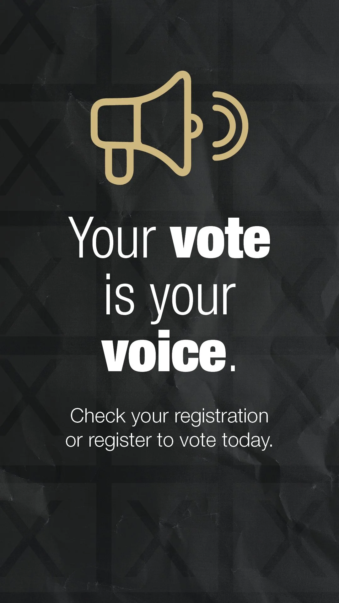
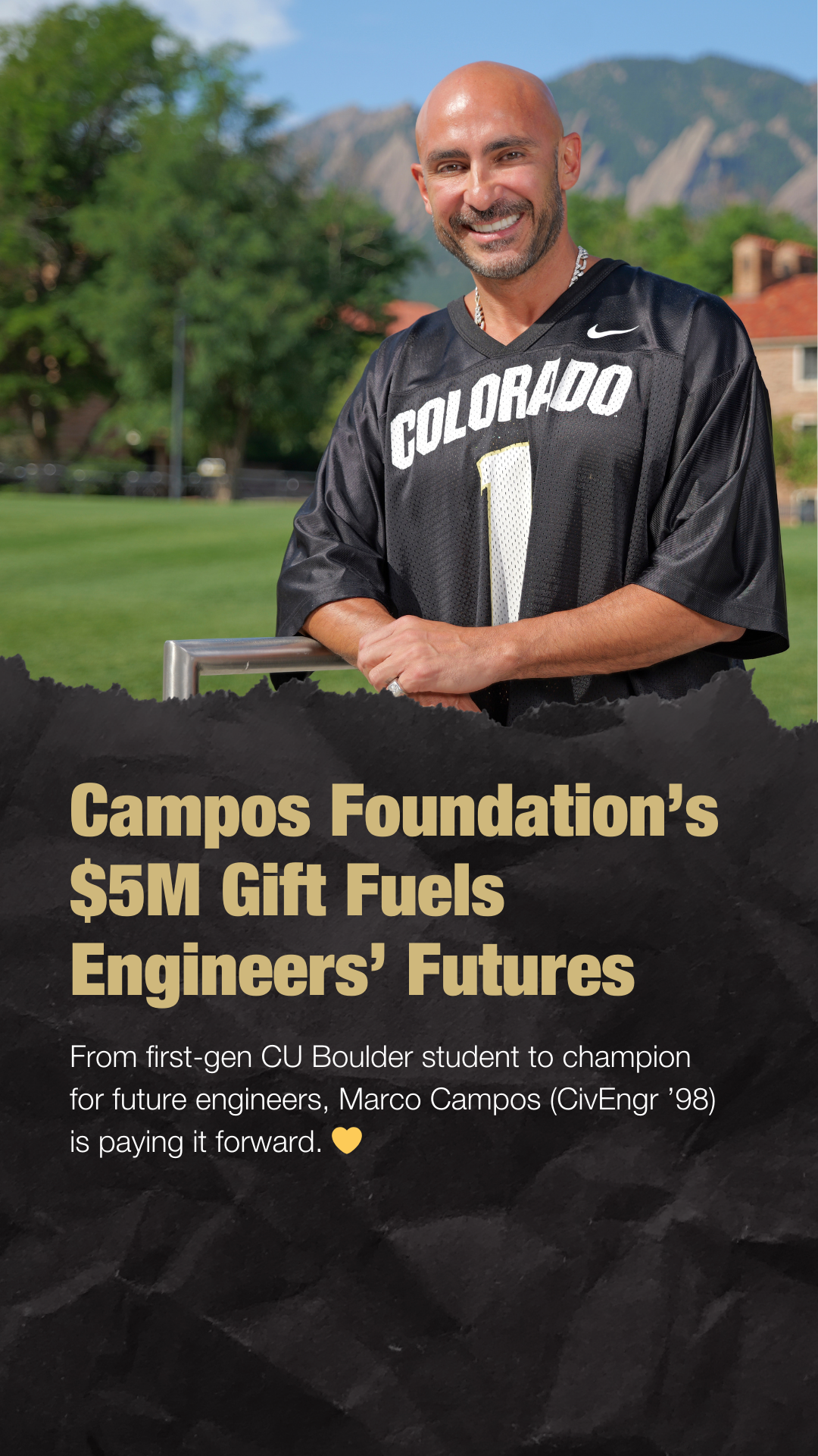

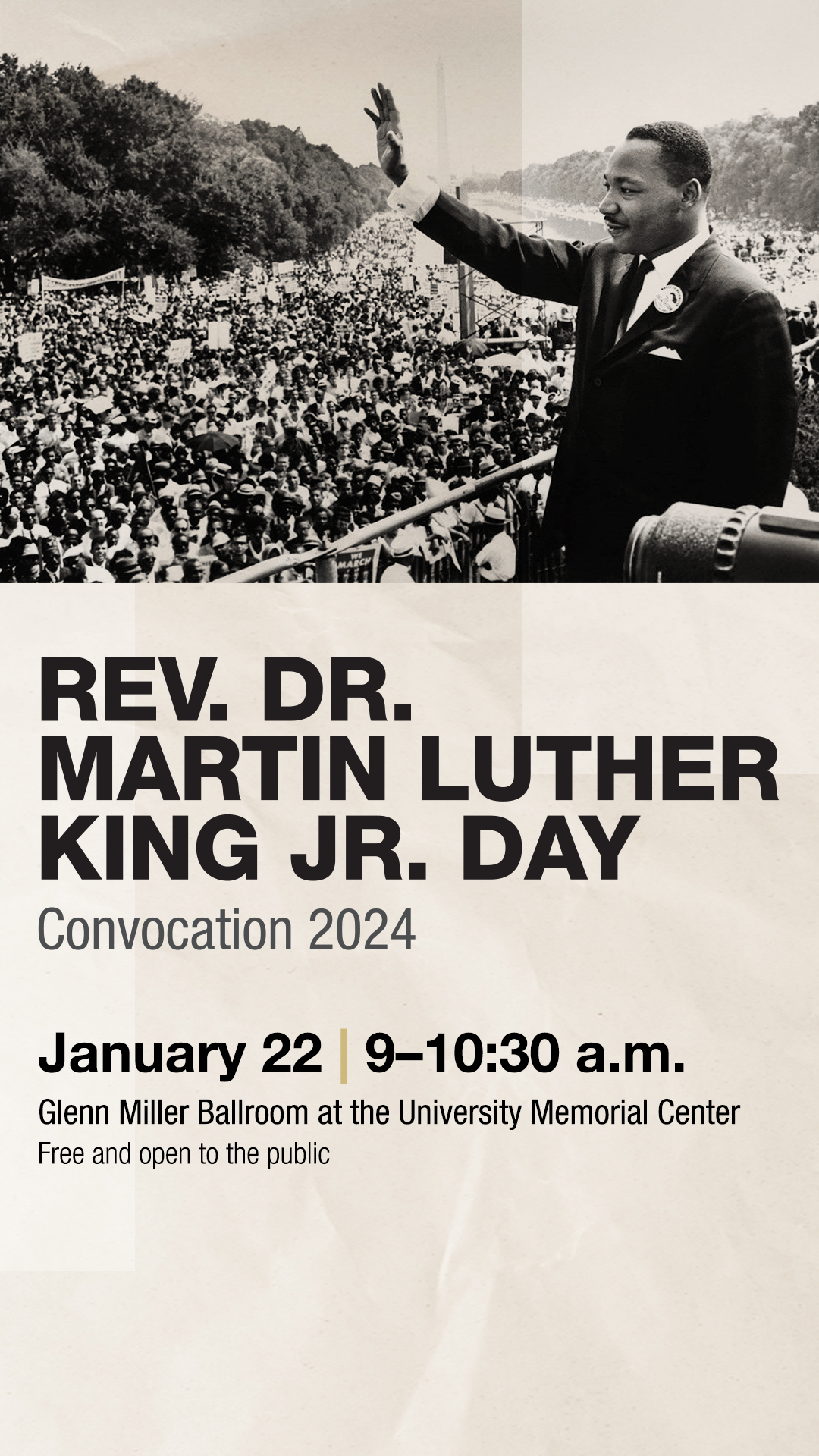

Social media templates


Social infographics templates
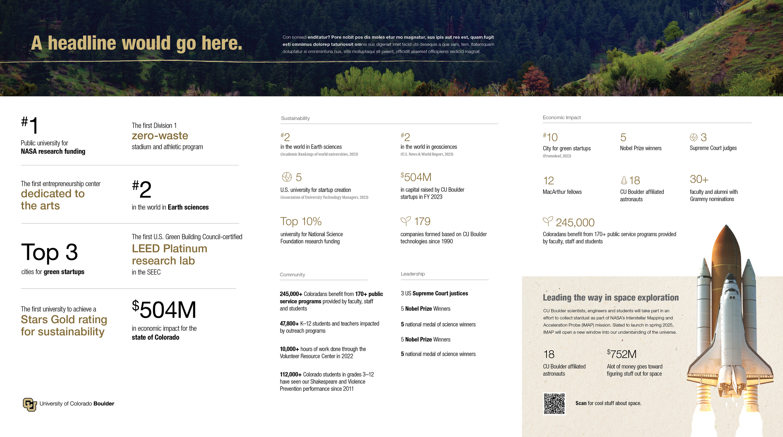
Brochure infographics example


Digital ad templates

Poster example
Brochure example