

CU Boulder Brand Refresh 2023–2025
Refreshing the University of Colorado Boulder’s brand was a complex in‑house effort to better align voice, visuals, and values. In the end, the team created a cohesive and flexible design system that better served audiences and employees.
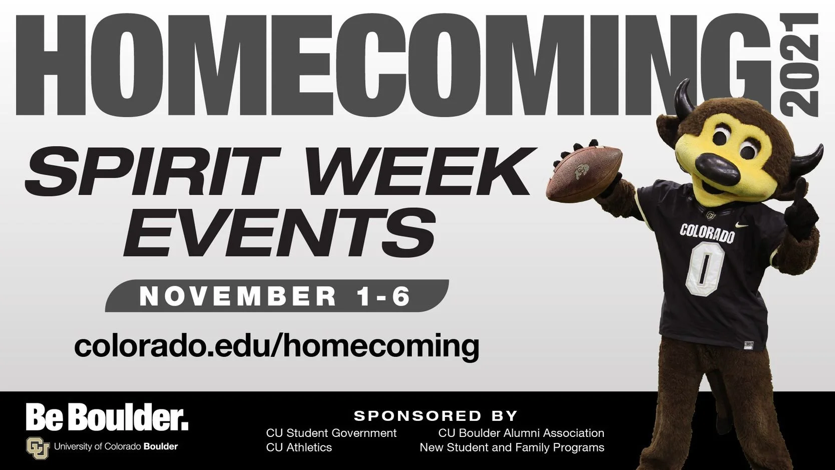
Before refresh digital sign and event poster
Challenge
CU Boulder’s visual identity wasn’t visually expressing it’s misson, values.
Branded materials were not cohesive across departments.
Some visuals looked outdated.
Brand audit and refresh must be completed in-house.
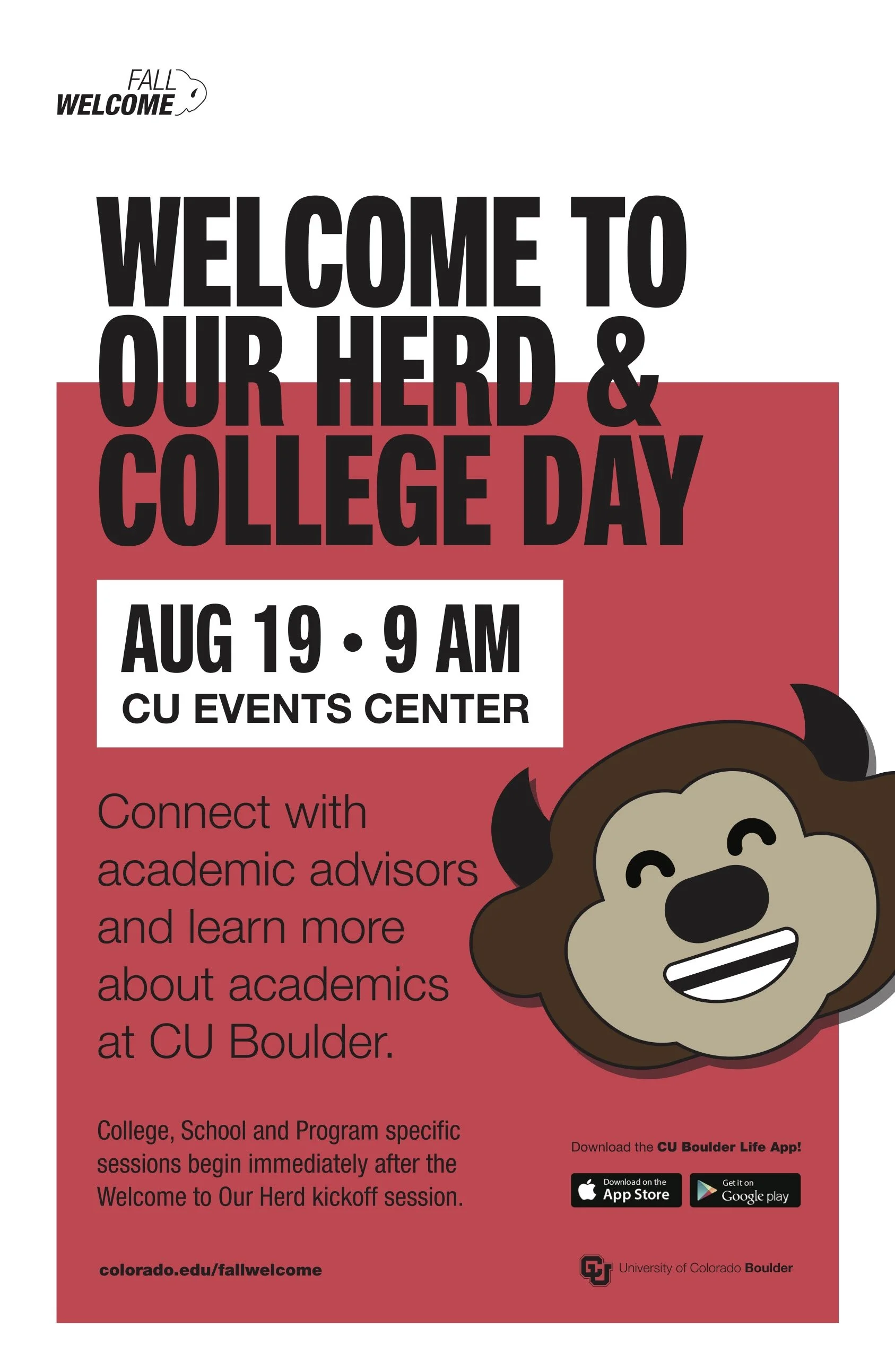
Before refresh poster design
Research
CU Boulder subject matter experts conducted a brand audit by collecting branded materials from campus units produced in the last 3 years.
The team created and distributed two surveys to CU Boulder communications staff.
One measured how well the materials followed brand guidelines. The other assessed how effectively the designs served their audience, aligned visuals with content, and suited their platform.
The team analyzed the results by comparing scores between brand alignment and the design’s success in terms of serving the audience, content, and platform.
A current state report summarized key findings. Both the survey results and audit process highlighted strengths to build on and areas for improvement.
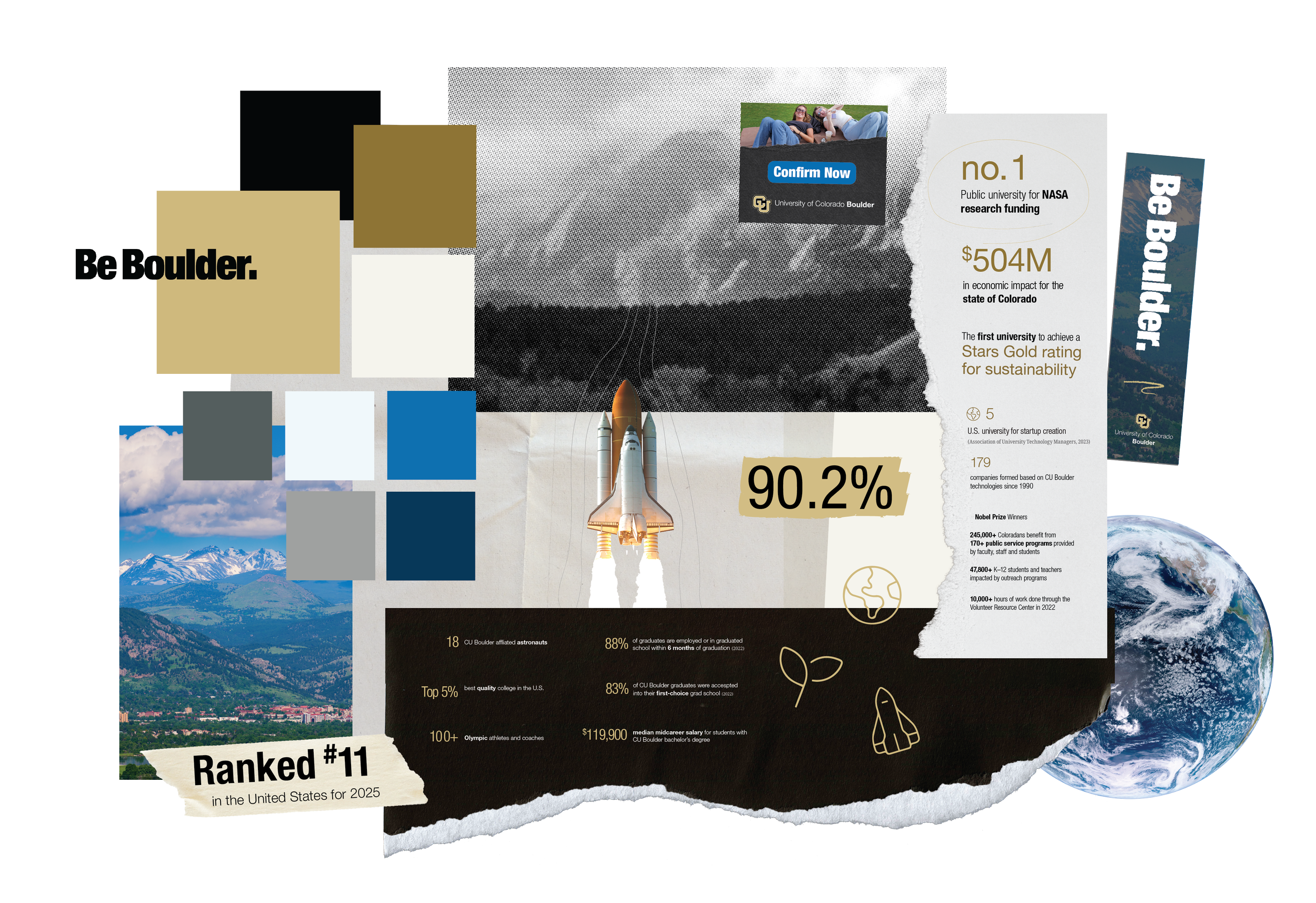
Before refresh brochure featuring infographics
Strengths:
Most assets followed brand guidelines.
Designs were generally consistent, on-tone, audience-appropriate, and platform-aware.
Core brand elements such as: primary colors, Helvetica Neue font, and the “Be Boulder” messaging platform.
Authenticity emphasized in photography style.
Opportunities:
Guidelines are applied inconsistently. Some are too rigid while others undefined.
Visual identity is tailored to limited audiences and media types and is not aligned to mission.
Brand lacks a clear, unified character and voice.
Designers and communicators lack centralized resources and access to brand tools and assets.
Current color guidelines lead to inaccessible uses.
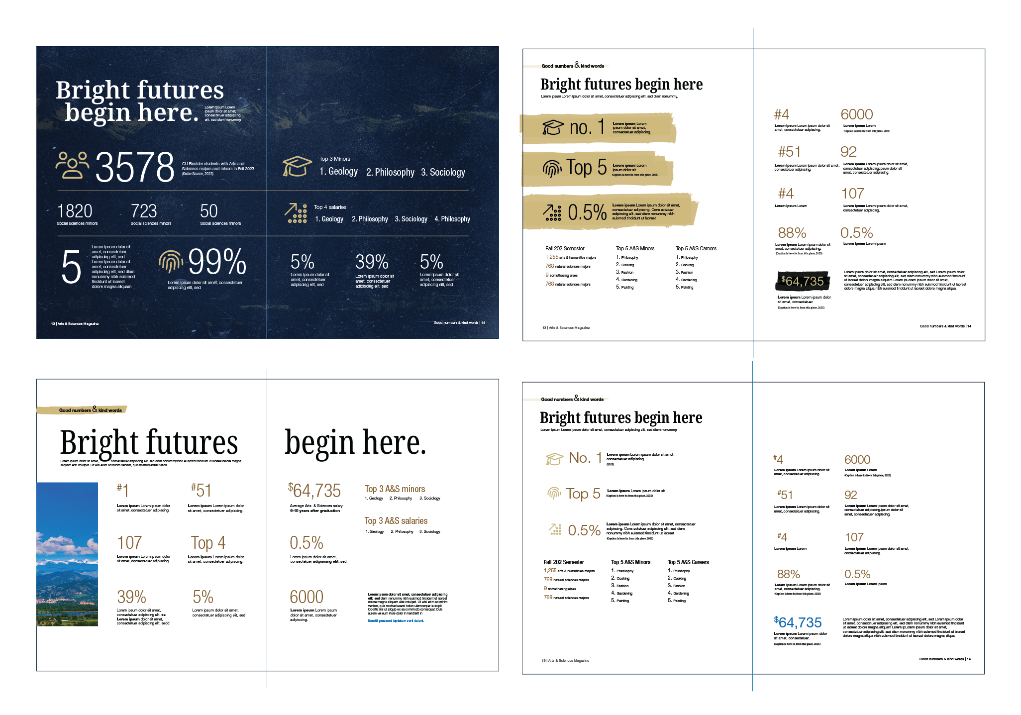
Infographics visual testing
Mockups and guideline revisions
Mockups explored:
secondary fonts and colors
typography hierarchy
specific photo editing
graphic elements
icon style
infographics style
Clear, succinct, and complete brand guidelines formed through synthesizing findings.


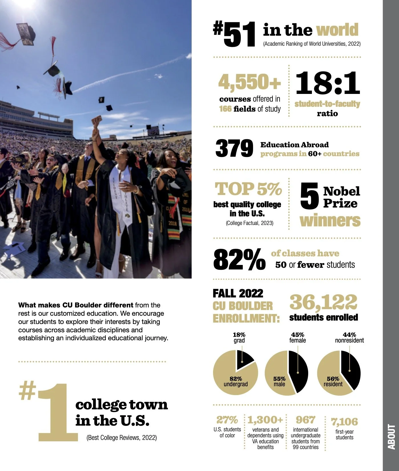
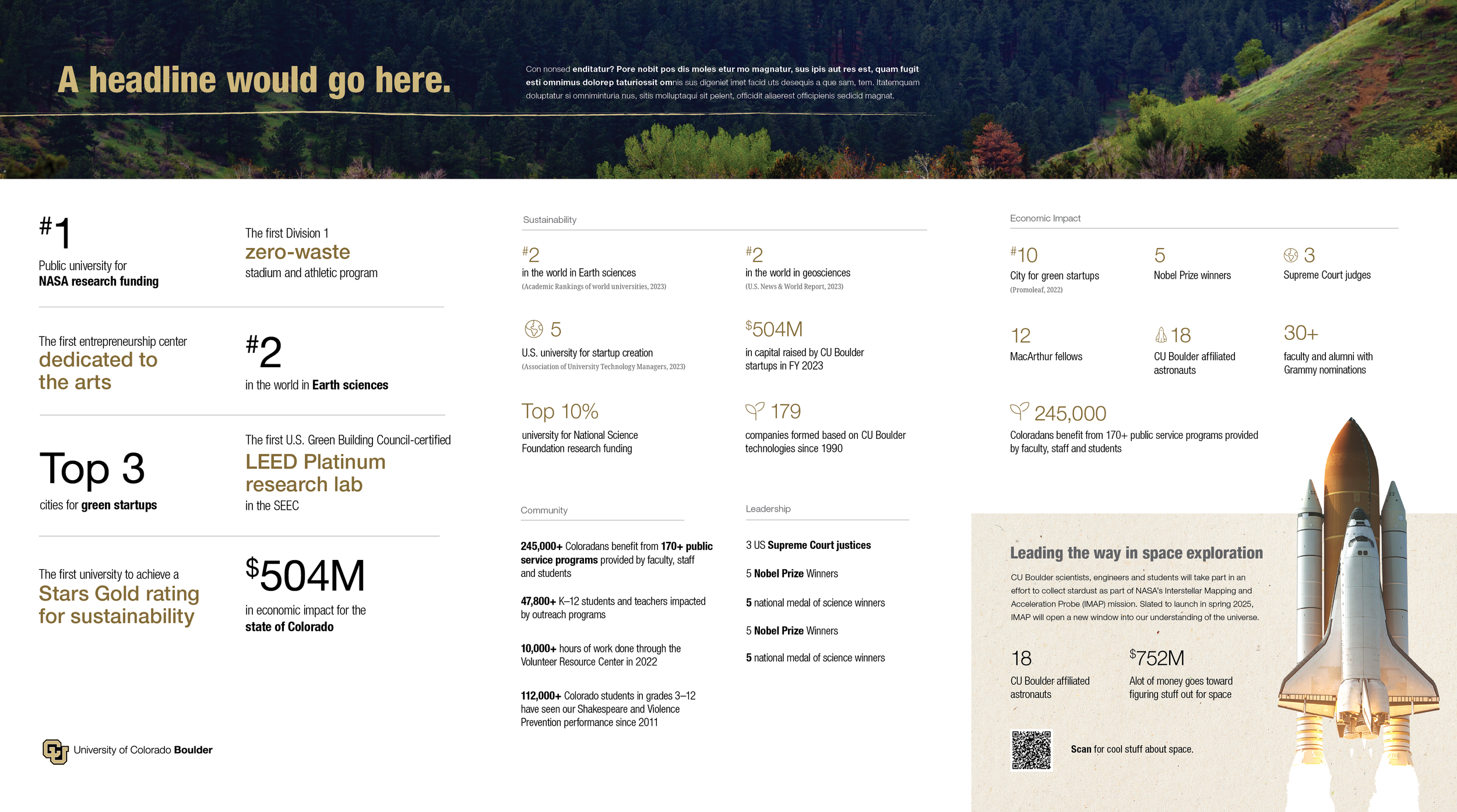
Admissions brochure

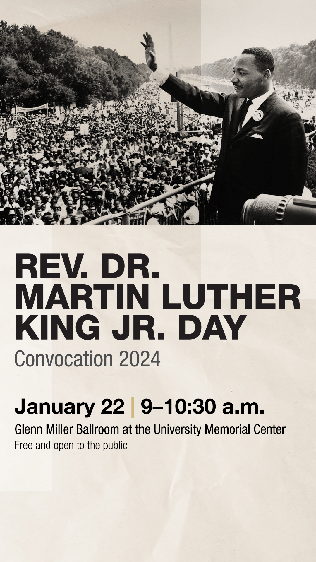
Event promotion poster
Solutions
-
The primary CU Boulder colors remained unchanged to leverage brand equity.
Because the previous guidelines were to pull secondary colors from photos, colors used across materials were not consistent.
New secondary colors solved accessibility issues, created cohesion, and connected to the colors on campus.
-
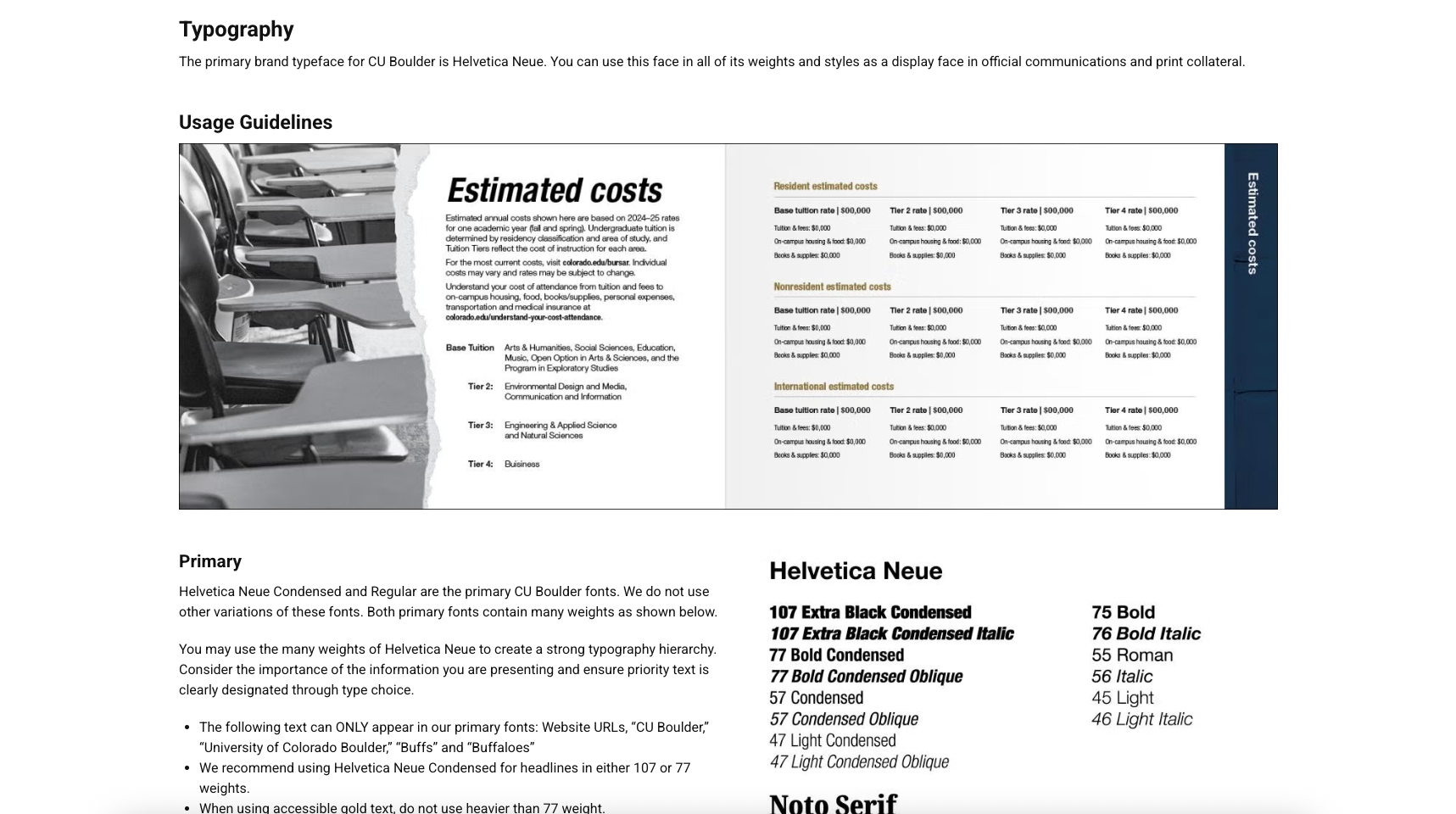
An official secondary font was never defined before. The team chose Noto Serif because:
A serif would compliment CU Boulder’s sans-serif font, Helvetica Neue
Many weights and variations
Easily accessed through Google fonts or Adobe CC
Designed with legibility in mind
-
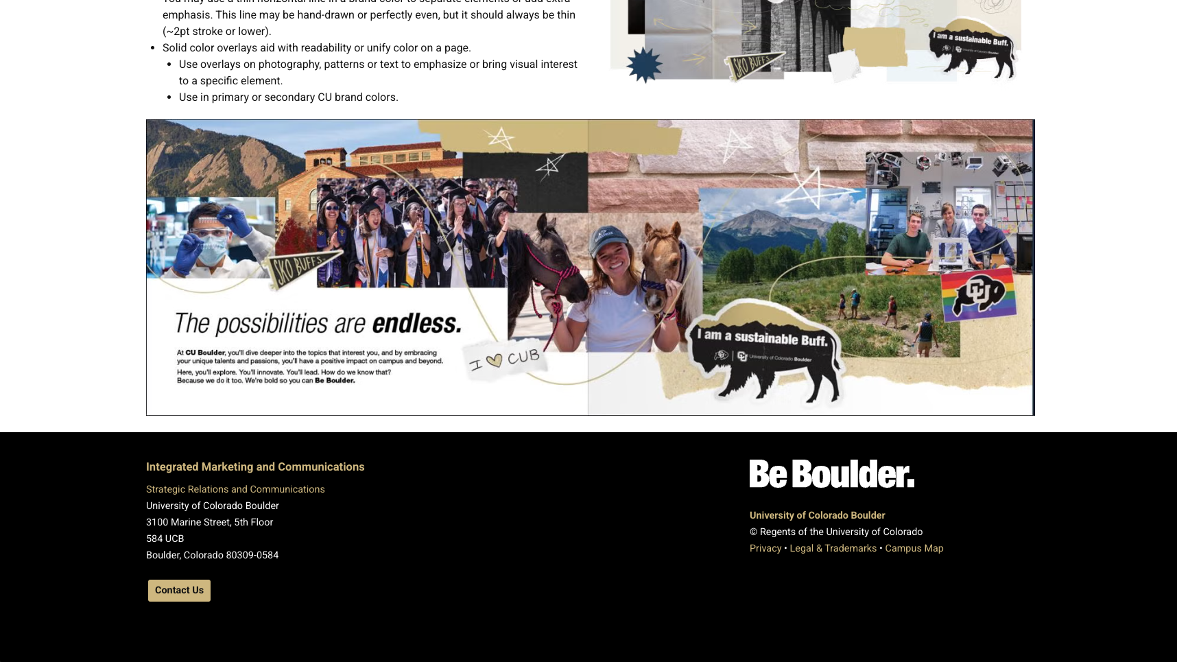
Paper textures and rips allow for creativity, variety, and can create a look geared toward younger audiences
Campus textures and scenics used as background elements
CU Boulder branded stickers used as graphic elements added analog texture and whimsey to designs
Thin hand drawn lines used for emphasis and doodles like stars, brackets, and arrows gave designs a younger and more personalized feel
-
The original photo guidelines did not allow for any photo editing whatsoever.
This strict photojournalist approach no longer served all of CU Boulder’s audiences.
Most of the CU Boulder’s photo style guidelines remained the same, the following specific photo edits were added to the guidelines.
Cut outs
Paper rips and textures
Black and white photos
Subtle grain and halftone dots
This opened the photo style up to more alignment with brand colors, and to more creativity without losing the authenticity.

Admissions brochure
Designing templates
After the guidelines were finalized, templates and examples could be designed.
A main goal of mine was to show how specific graphic elements, typography choices, photo use, and layout style could be in brand while catering to the content and the platform.
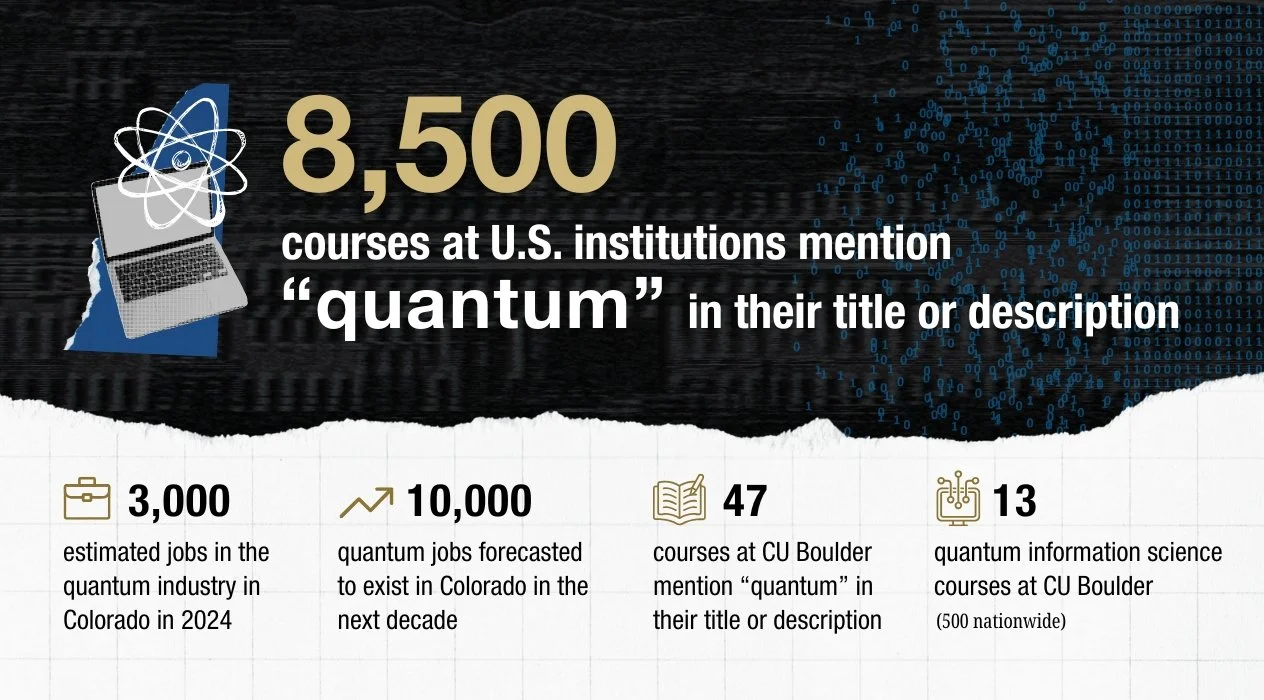
Brochure template featuring infographics
User-friendly social media templates empowered designers and content creators of varying skill-levels to create high-quality on-brand content.
Brand kits created the centralized location for designs and assets that CU Boulder needed.


Social posts designed from templates
All refreshed guidelines were compiled into the new CU Boulder brand site.
Refreshing the site was a collaborative effort between writers, graphic designers, and UI/UX designers.
The CU Boulder brand site includes:
The most up-to-date brand information and examples
Photo galleries, video assets, and departmental lockups
Brand toolkits, website guidelines, and receiving brand support
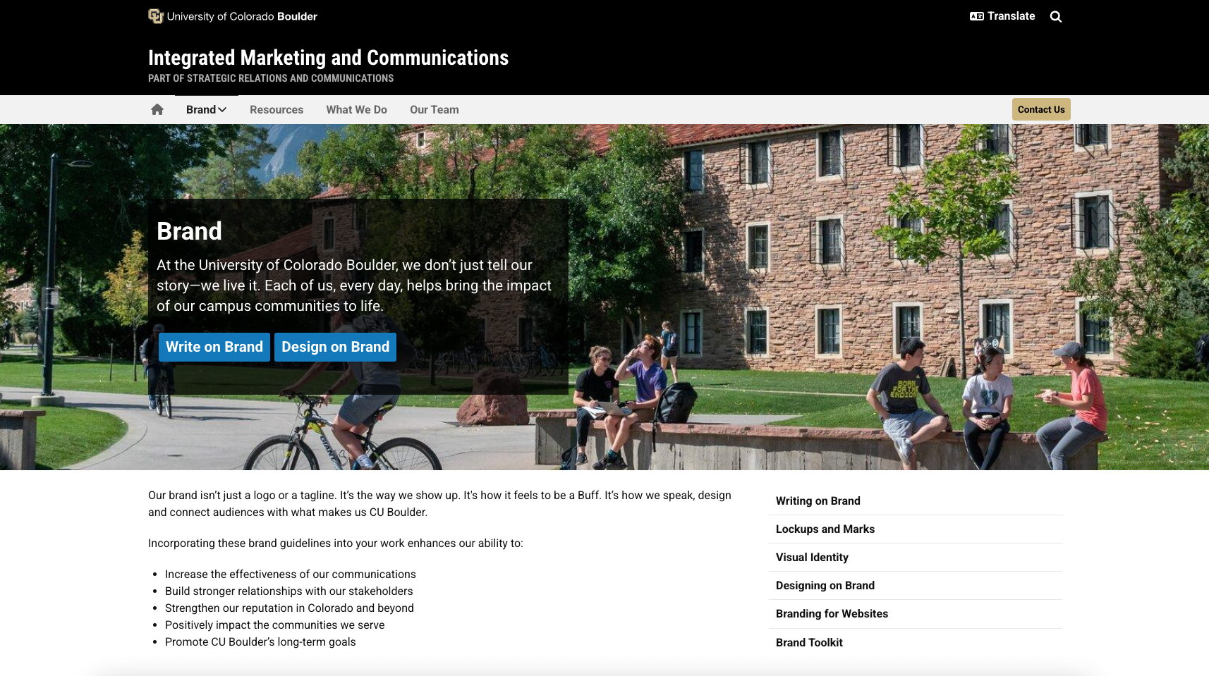

CU Boulder brand site 2025
CU Boulder’s statewide perception rose 5 points in the Spring 2025 annual survey.
Designs produced after the brand refresh followed ADA accessibility standards.
Improved brand consistency and alignment with mission, values, character, and voice.
Results
The CU Boulder brand refresh (2023–2025) made significant advances and impact on CU Boulder’s designs and communications. More data, insights, and opportunities for improvement will arise as this iteration of the brand refresh is applied across campus.
The CU Boulder brand and visual identity will continue to evolve.
Centralized access to brand guidelines, templates, toolkits, and resources improved efficiency and quality.
New evaluation and design processes made the brand refresh repeatable, sustainable, and effective.